Arms of love
Arms of love is a nonprofit organization tasked with providing help to people in need, orphanages, and families struggling to make a decent living in the European country of Romania. This nonprofit is relatively new and needs some help getting an online presence. We agree with the stakeholders and respect the decision to have transparency as the primary focus so that more people will be inclined to give.
How might we design a charitable website that showcases transparency so that users want to donate and can.
Deliver a comprehensive user experience while focusing on showing transparency.
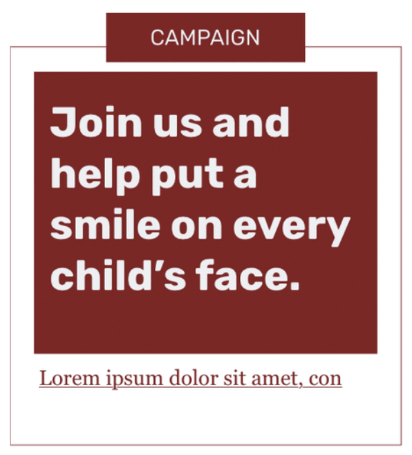
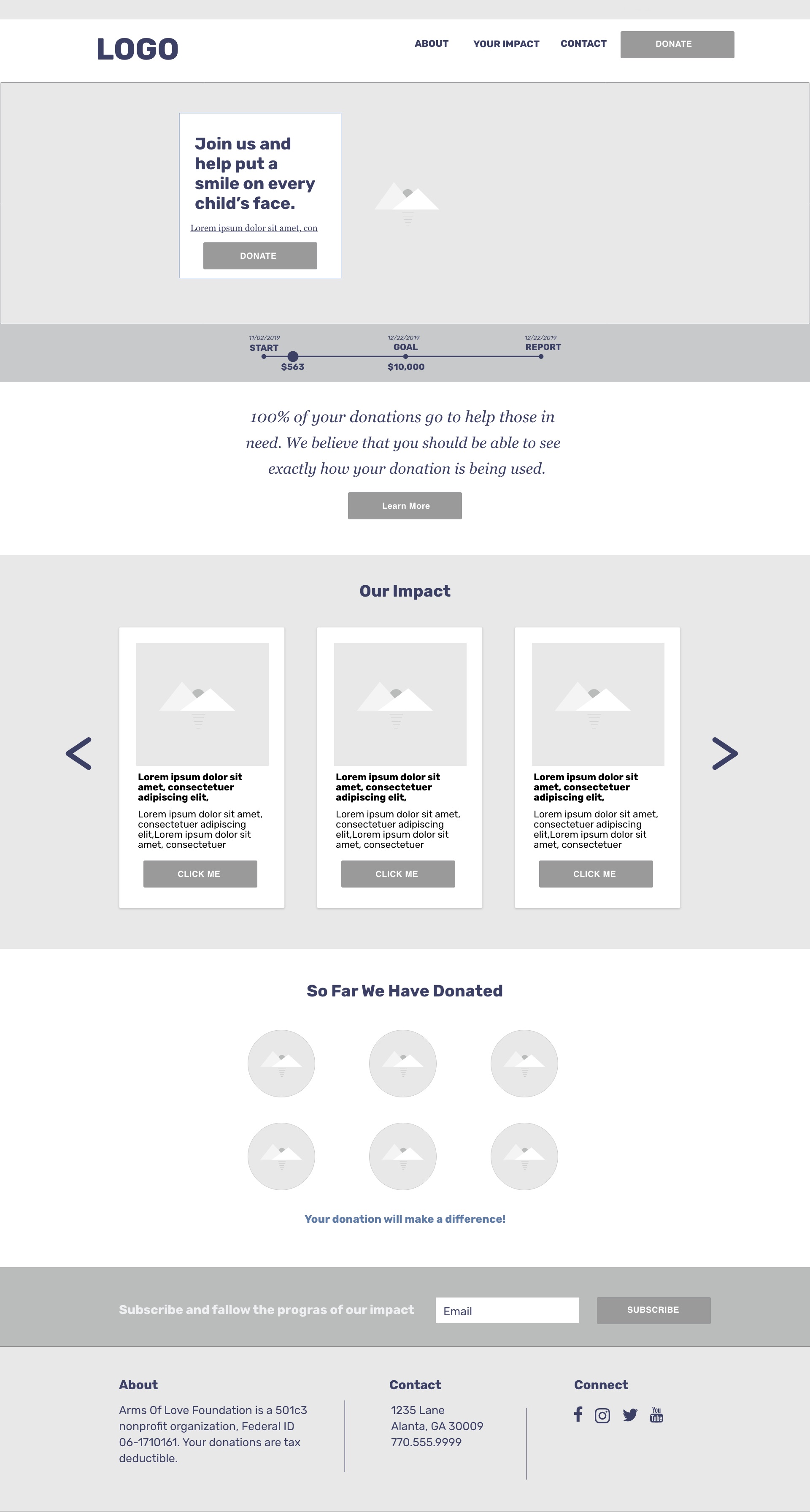
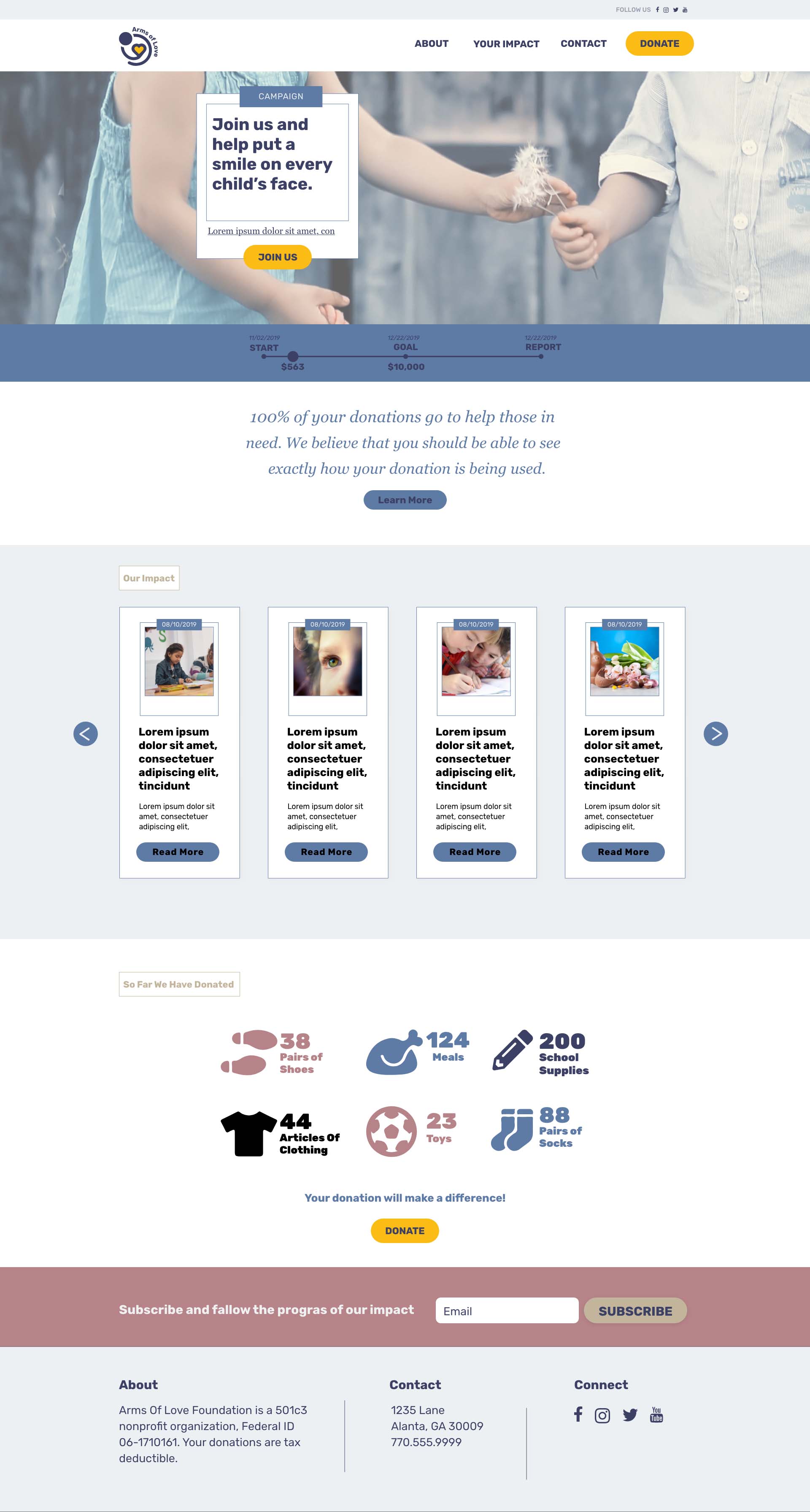
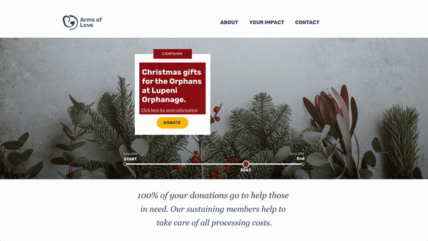
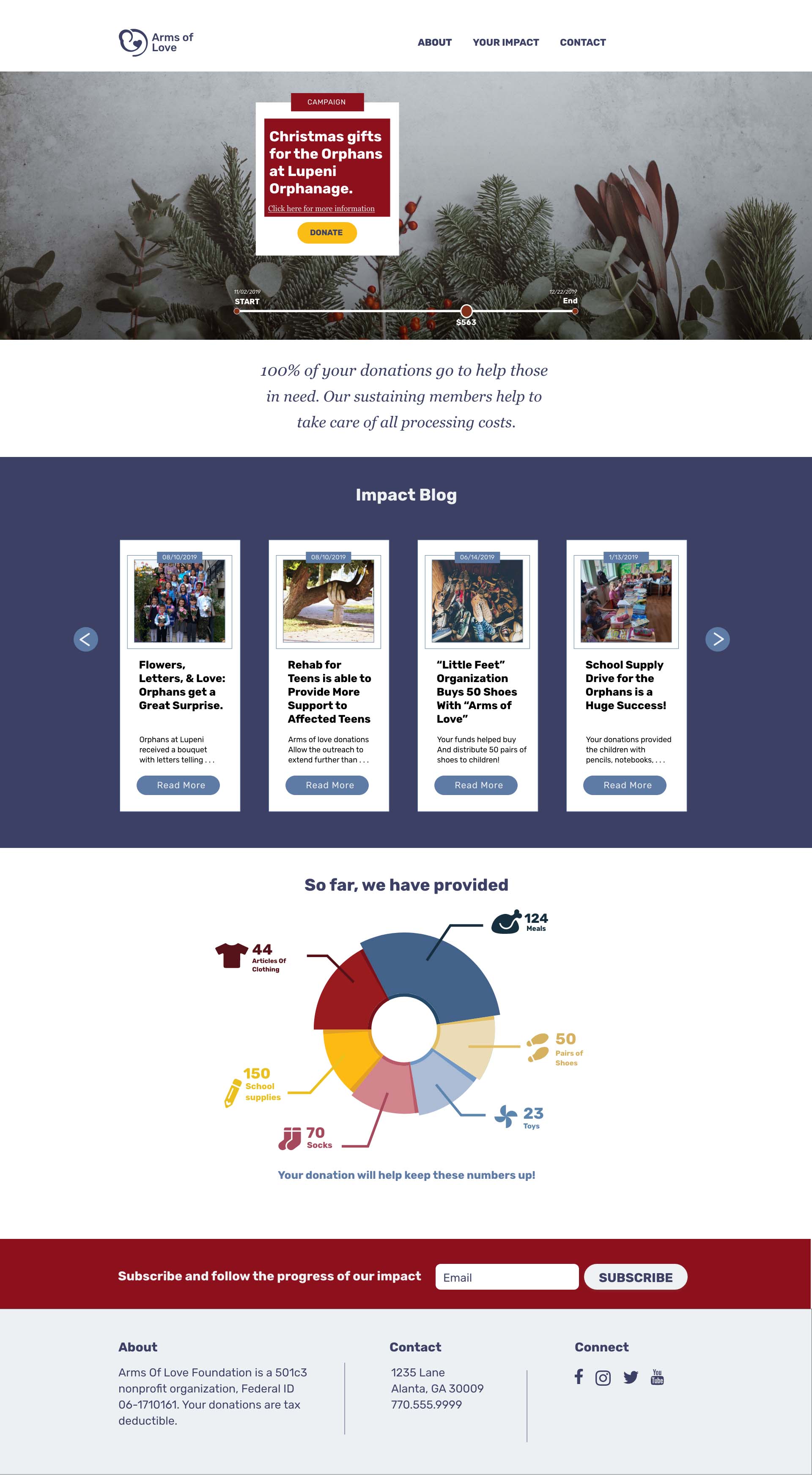
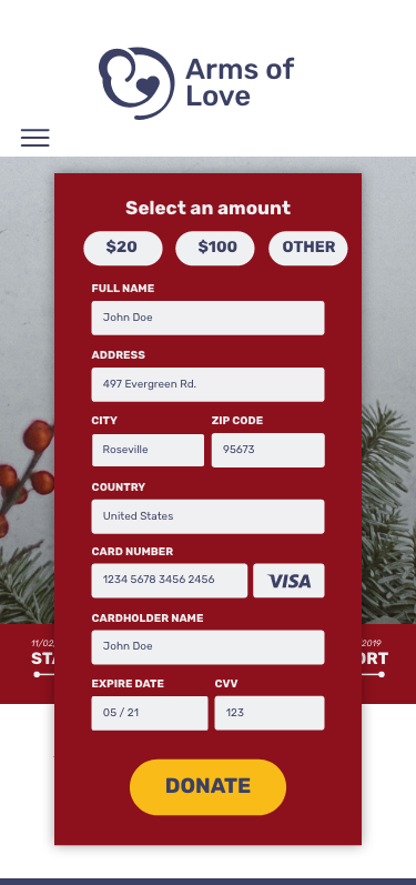
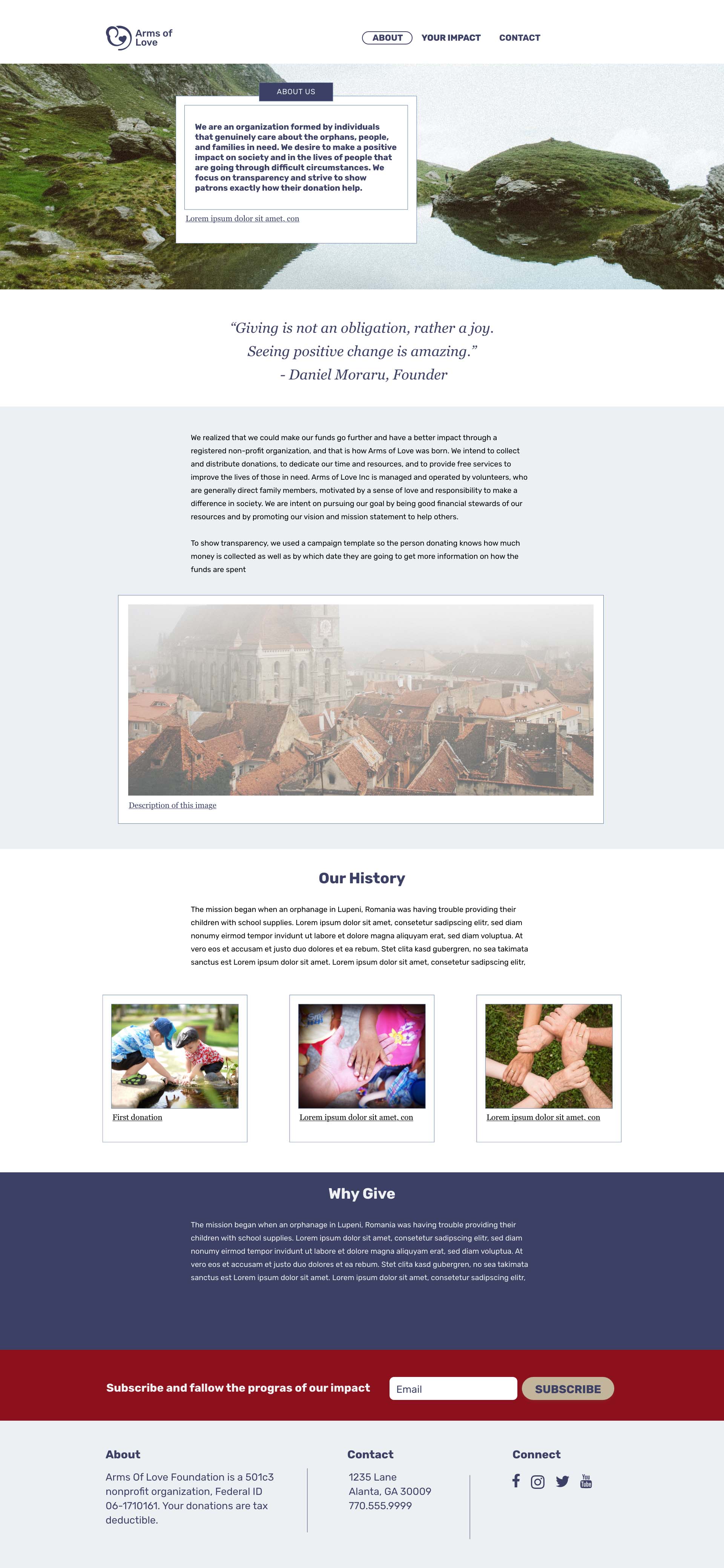
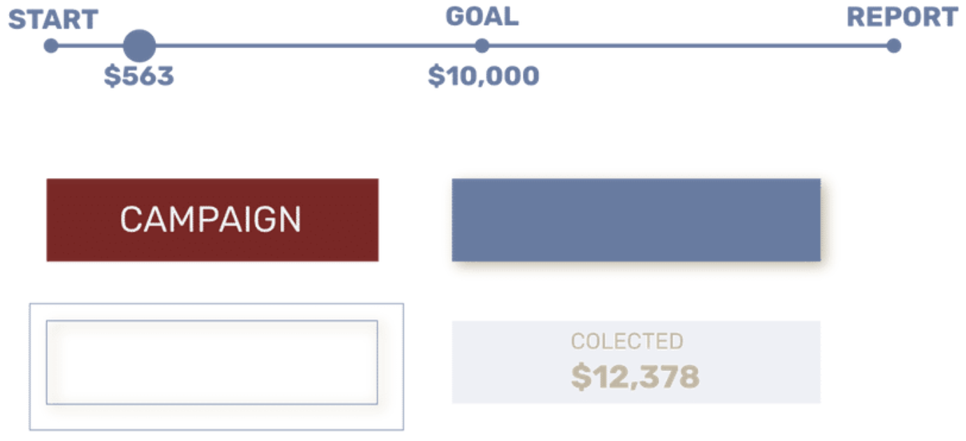
Both users and stakeholders have expressed that transparency is the number one priority. To emphasize it better, I decided to introduce campaigns. On the home page, the current campaign with up to date status greets you. There will be a start date, an end date, and everyone will know how much money is collected at any given point. Anyone who has donated or signed up will receive a report on how the funds ware used.
Reaserch We started the research by surveying people that are involved with charitable organizations and give frequently and interviewing stakeholders. We ware able to group similar ideas and determine vital insides after understanding the user and heuristic analysis of competitors.
Analysis and Ideation Together we analyze the data using an affinity diagram, compiling common occurrences, pain points, and insides to follow, creating a user persona and value proposition.
Design System I wanted to keep the look and feel friendly and approachable but with a serious note. Designed the logo and solution.
Style guide, wireframes and prototypes
Testing
I worked with a researcher to gather and analyze the data. My main contribution was ideating and visualizing the solution, the style guide, the lo-fi, and the hi-fi prototype. I collaborated with another designer in the first sketches of the logo.
Timeline: 3 Weeks
Reaserch
We started by interviewing the founders, in a 45-minute interview, we had a better understanding of their expectations. They revealed that they need a way for users to donate safely and a way to showcase transparency. From their experience, they get more donations when people trust them and perceive their organization as transparent.
In addition to interviewing the stakeholders, we conducted four 1-on-1 interviews with potential users. We prepared a total of 16 questions
and asked the participants to expand upon each answer, providing qualitative data to draw critical insights. Our target demographic was people
who have donated before. We wanted their thoughts on the donation process they experienced and their motivations.
Useful quantitative data was collected via an online survey. Forty-six participants completed the study helping us understand the market.
Key Insights
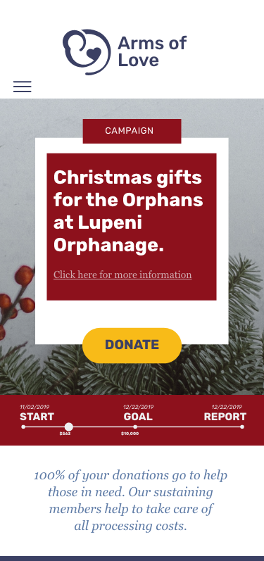
- Donating goods vs. money, people don't have a preference if there is transparency.
- Using different wording for donating buttons.
- Interactive content is prefered.
- The value proposition must be clear and displayed in a prominently.
- Providing options to users for more information.
- People typically find out about charities from words of mouth.
- Users want feedback.
- Users are willing to contact with the people they are helping.
Heuristic Competitor Analysis
As a team, we performed three competitive heuristic analyses of our competitors, global children's organizations, Unicef, and Miracle. To compare and contrast existing and similar nonprofits to find best practices and draw inspiration for the final design. Some of our discoveries include haveing multiple donate buttons on a page that can be perceived as aggressive by the user and off-putting. Unicef address that issue with language - they also had numerous buttons that lead you to donate, but they had different wording.
Patterns positively affecting users:
- Strong Value Proposition statements front and center.
- Visually show how their impact is being measured.
- Showing pics and stories of real beneficiaries.
Analysis
Together we analyze the data using an affinity diagram, compiling common occurrences, pain points and insides to follow. As well as prioritize features and created a suer persona.
Affinity Diagram
After collecting and grouping the data into an affinity diagram, valuable insides become apparent.
- Resons to donate
- Opportunities for improvment
- Thoughts on transperancy
- Pain points users experiance
Features
Any project needs to focus on a few features at first. What would be the minimum viable product? The 3 most important features go hand in hand with our goals:
- Mission - What are people donation to
- Multiple ways to donate - Users are comfortable with a variety payment methods
- Impact reports - After each campaing an detailed impact report will be posted
- Social media presents - Majority of our test subject listed social media as to how they find charities to donate to
User Persona
After compiling and analyzing all the data, we used the information to develop a user persona and a value proposition. The user scenario shows potentially how our persona will come to land on the page and use our services.
Cristina recently had a phone call with a childhood friend of hers. Who is still living in Cristina’s home town of Baia Mare. The situation with the local orphanage is in dire straits. The kids run around barefooted, and it is not a pleasant situation. Cristina quickly decided that she want to donate. She goes online and googles nonprofits giving to Romania.
User Flow
We created a flow as well
- Ideally the user should be on the site to donate
- If they are not donating they need more information and click "about us"
- If they want to know how the money was spend in the past campaigns click "your impact"
- After finding more information and understanding how the funds are used the user donates
Value proposition
100% Of your donations go to help those in need.
Our sustaining members help to take care of all processing costs.
Design System
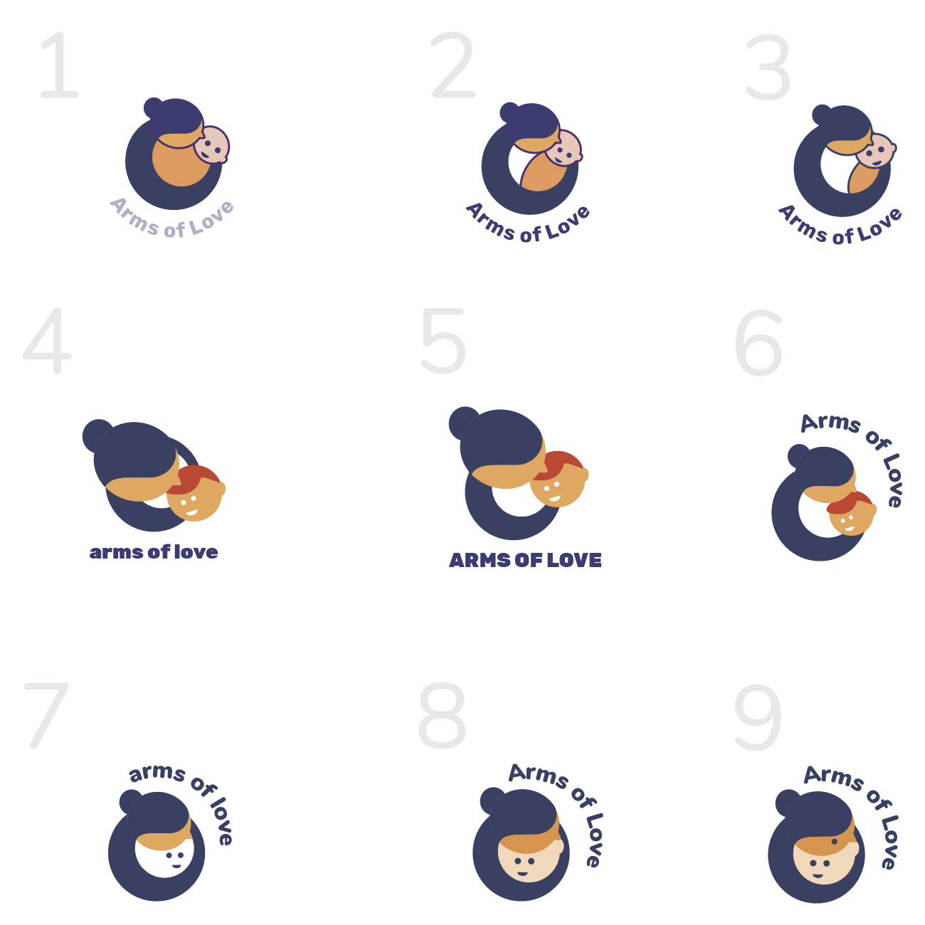
Logo
I took some of the hand-drawn sketches Ted Kim had quickly put together and started vectorizing them, trying to create a simple, recognizable yet memorable mark. Still, the founder expressed that the first round of logo sketches depict a very motherly feel because they help more than just orphanages. They wanted the logo a bit more ambiguous.
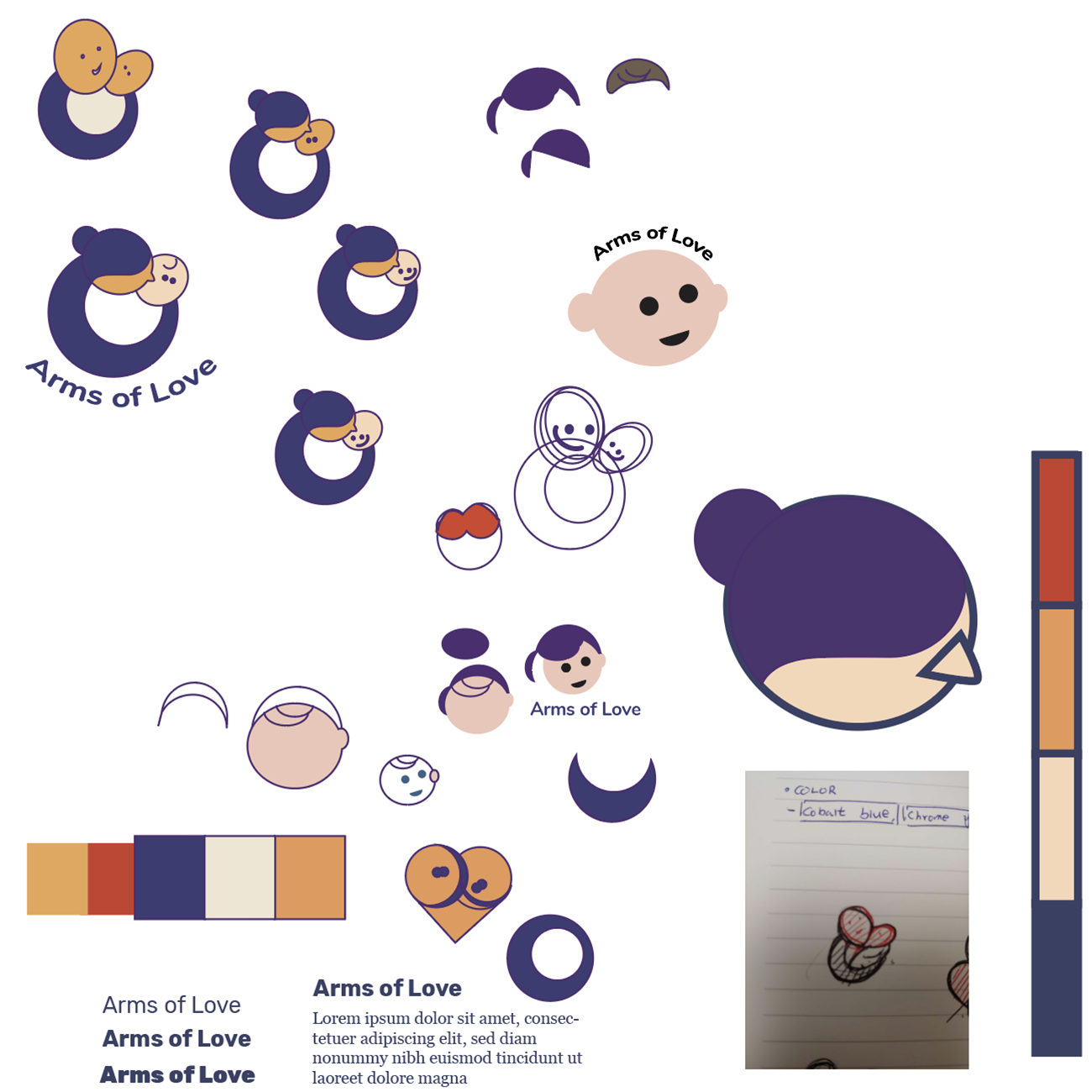
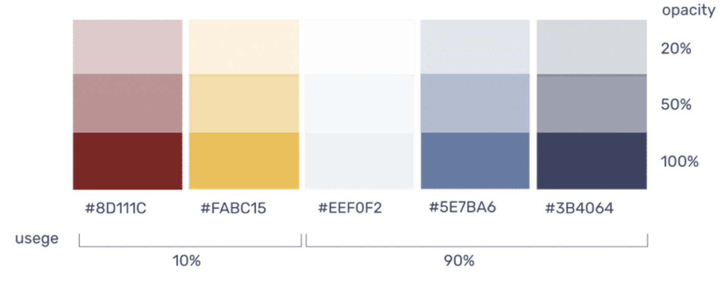
Colors
Because the non-profit focuses on helping people in need mainly in Romania. The colors we chose are reminiscent of the Romanian flag, but with a softer twist.
Typography
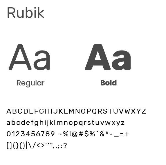
Rubik Rubik is a sans serif font family with slightly rounded corners. We chose it specifically for that feature. We wanted a softer friendlier font that could also appear serious, with a variety of weights.
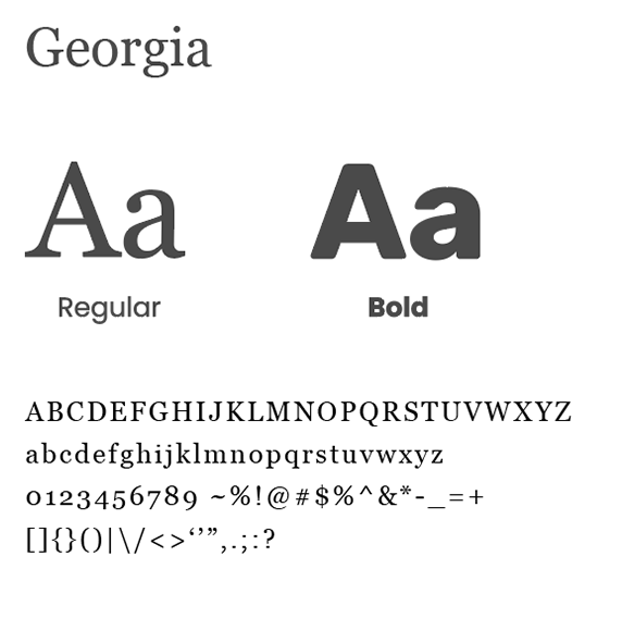
Georgia We chose Georgia as a secondary font to depict mainly body copy. Georgia is a web safe font. It was intended as a serif typeface that would appear elegant but legible printed small or on low-resolution screens
Elements
The graphic elements are also in minimal style a simple rectangular in a solid color or a border
Controls
Buttons are simple pill-shaped. Join us and learn more are in a saddle blue while eager donate buttons are standing out in bright yellow. A gentle shadow is employed for the hover effect

Cards
While interviewing the stakeholders, the conversation always circled back to the pictures of the kids they helped and how they wanted to share these images with the donors. So I designed the cards and elements with the idea of a polaroid picture.