Note taking feature redesign
Aspirion is a healthcare revenue cycle company that helps providers recover complex and denied claims. Associates rely on Compass to manage this work, but the note feature was inefficient and slowed productivity.
I led the redesign of Aspirion’s Compass note feature to make workflows faster and more intuitive. Research showed that the old process was slow and frustrating, taking over eight minutes per task, so the new design focused on usability, clarity, and efficiency.
Focused on employing typographic principles promoting speed reading, redesigning the note feature as static, and introducing templates.
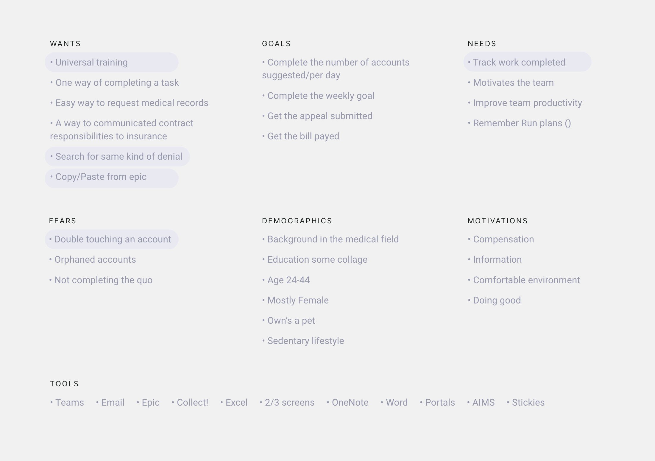
Research Collected qualitative and quantitative data via surveys and shadow sessions
Discovery Aligned with business goals and set KPIs, map flows
Prototype solutions Analyze findings ideate solutions
Test
Research
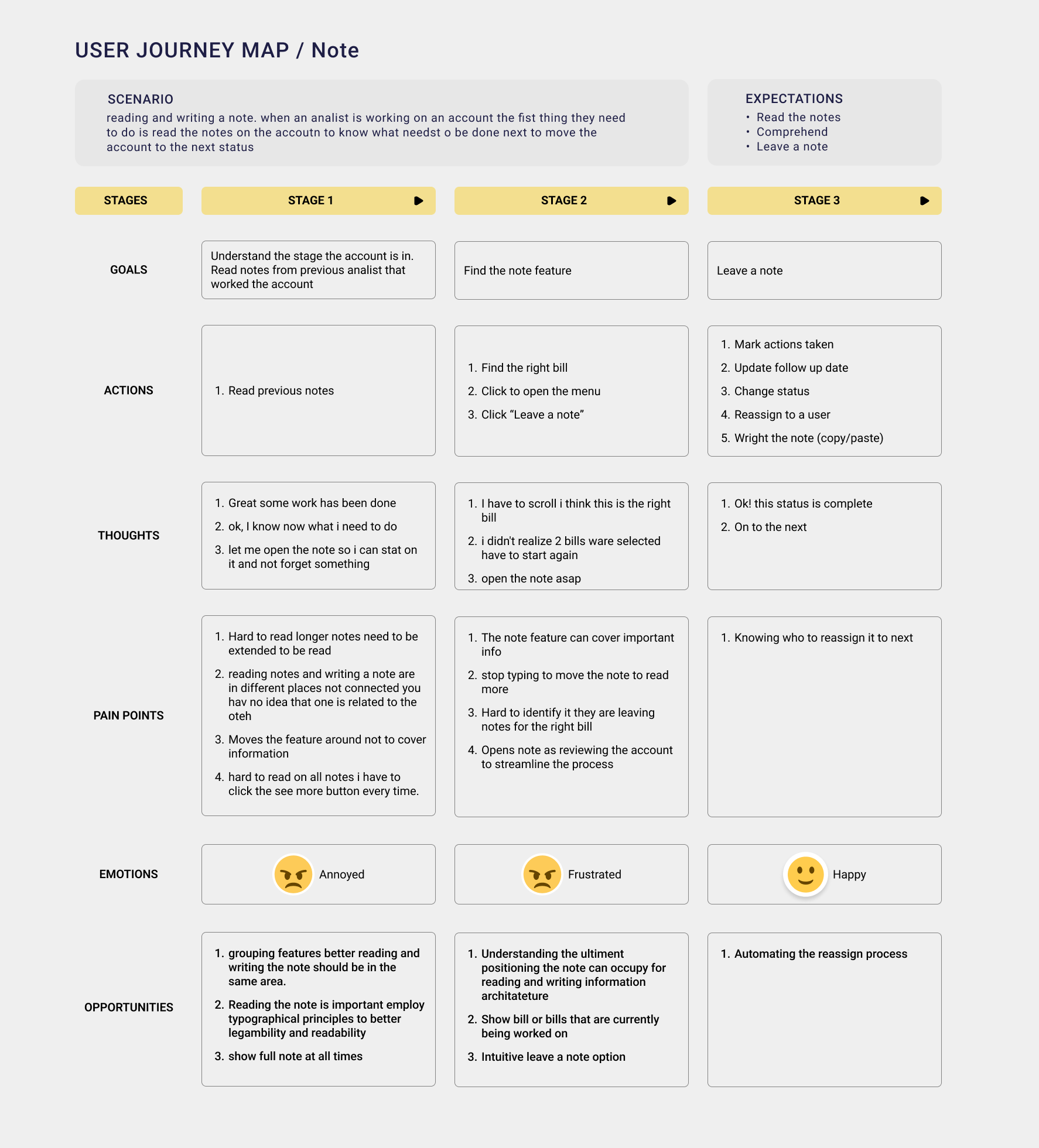
Research showed that the pop-up note module blocked key information, leading users to rely on Microsoft Sticky Notes to paste their own repeated note structures for specific scenarios.
Here is what some interviewers had to say:
"I like that I can move the note to look at different fields, but sometimes I lose where it is."
Cinthia Mackey
"It took me forever to find how to prop it open and it was not easy to remember"
Larry MacNarmin
"Sometimes when you move the note box too much or too fast or too something it just disapears, and you have to start all over again"
Felicia Sanders
Discovery
We measured the impact of the redesigned note feature using key performance indicators focused on time, ease, and accuracy.
Goal
Note-Taking Time
Note comprehension
User Satisfaction
Task Success Rate
Error Rate
Template adoption Rate
Alert
Uninterrupted time
Time frame
Stress, satisfaction
Notes posted
System errors
Templates used
Metric
Estimated time
From account opening to commencing work
Analyst satisfaction
Percentage %
Percentage %
Percentage %
The Redesign
The redesigned note feature allows users to find information faster and add notes with fewer clicks. Moving away from infinite scrolling and loading a limited number of notes at a time significantly improves performance and reduces load times.
Note Reading & Writing
Displaying the date at the top of each note helps analysts quickly identify and locate the right note without extra searching.
External note colorThe external note color was originally green, which provided strong contrast but conflicted with action buttons. Adjusting the color improves hierarchy and clarity.
Characters per lineLimiting each line to about 45 characters enhances readability and ensures that the full note remains visible without horizontal scrolling.
Load seven external notesUsers typically view about four external notes at a time. Loading seven notes per batch, with an option to load more, speeds up Compass account performance and improves efficiency.
Research showed that users frequently moved the note window to access different content and often left it off-screen. Making the note static ensures it remains visible and accessible.
Vertical layoutThe note window was redesigned vertically to better fit various content structures and align with users’ natural reading flow.
Consistency across use casesThe new layout ensures consistency across different scenarios, making note writing and reviewing more predictable and efficient.
Note Templates
As analysts move accounts from one status to another, they follow a defined sequence of steps. To streamline this process, note formats are now connected to bill statuses. Selecting a bill expands the note panel for quick access to relevant content. Explore the prototype below.
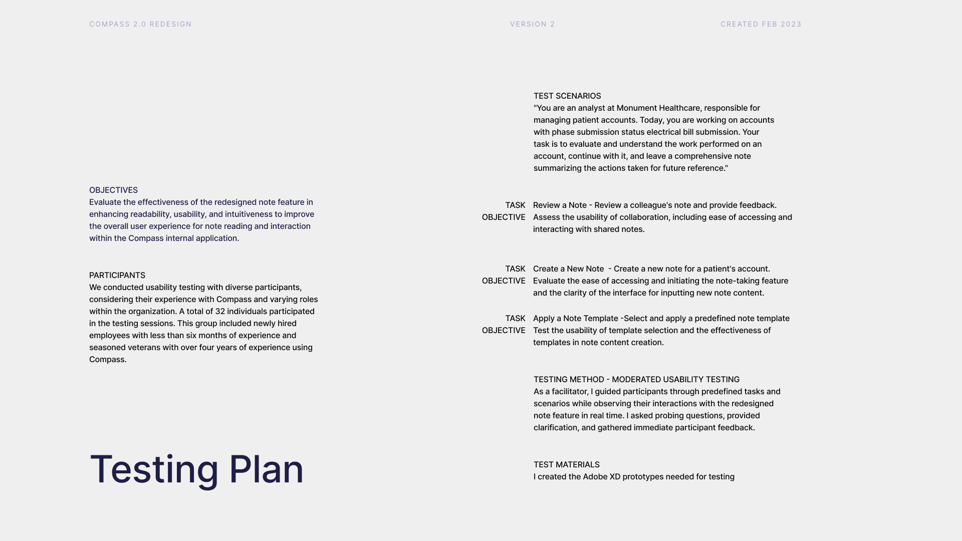
Usability Testing
Objectives
As the lead designer for the Compass note feature redesign, the goal of usability testing was to assess improvements in readability, usability, and intuitiveness. We tested with 32 participants ranging from new hires to experienced analysts. Through moderated sessions, participants completed tasks like reviewing and creating notes while we collected both qualitative and quantitative data.
Feedback
We gathered insights through task metrics, user comments, and post-test surveys. This approach helped us evaluate both performance and user satisfaction, capturing how easily participants navigated and applied the redesigned features.
Results
Comparing success rates, heat maps, and task completion times revealed strong gains in efficiency. Affinity mapping highlighted recurring patterns and provided a clear view of where the redesign improved usability.
Key Findings
Testing included 32 users with varying levels of Compass experience, from new employees to senior analysts. Results confirmed measurable improvements in speed, accuracy, and clarity.
1. Reading and comprehension times improved by 37%.
2. Note completion speed increased by 22%.
3. Users found the redesign more intuitive and aligned with familiar industry patterns (e.g., Epic).
4. Testing revealed confusion caused by inconsistent terminology, emphasizing the need for unified language.
Impact on Design
A UX writer was engaged to standardize language across teams, addressing inconsistencies that surfaced during testing. This alignment improved clarity and created a shared understanding among analysts from different departments and newly acquired companies.
Conclusion
Usability testing reinforced key design principles: clear communication, a user-centered approach, and cross-functional collaboration. By continuing to iterate and gather feedback, we ensure that Compass evolves into a more intuitive and effective tool for every user.