Optimizing workload distribution
Aspirion is a healthcare revenue cycle company that helps providers recover complex and denied claims. Analysts use Compass to manage daily work, but the existing queue system created confusion with excessive filters, complex sorting, and an unintuitive grid layout. I led a redesign to simplify the workflow, reduce manual effort, and align the platform with how analysts actually work.
Our goal was to make Compass truly user centered and solve real problems. Since replacing Polaris in 2019, Compass has grown to 700+ analysts across seven service lines, yet its design still reflected old workflows. We aimed to modernize it around analyst needs and build a flexible foundation for a rapidly evolving business.
Our high level goals were to:
- Make it fast and easy to use for everyone.
- Give analysts more control over their workload and process.
- Create a platform for innovation and deeper engagement.
Research
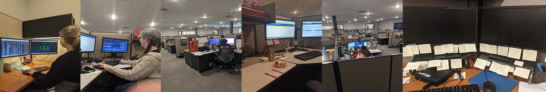
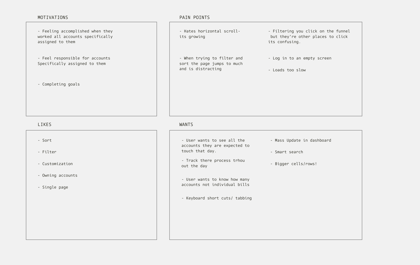
We interviewed and shadowed 30+ users to uncover key workflow challenges in Compass.
- Excessive contact for workload coordination
- Suboptimal sorting and filtering options
- Analyst workload comprehension gaps
- Double touching an account
- Tracking progress
- Hospitals send inconsistent lists
Discovery
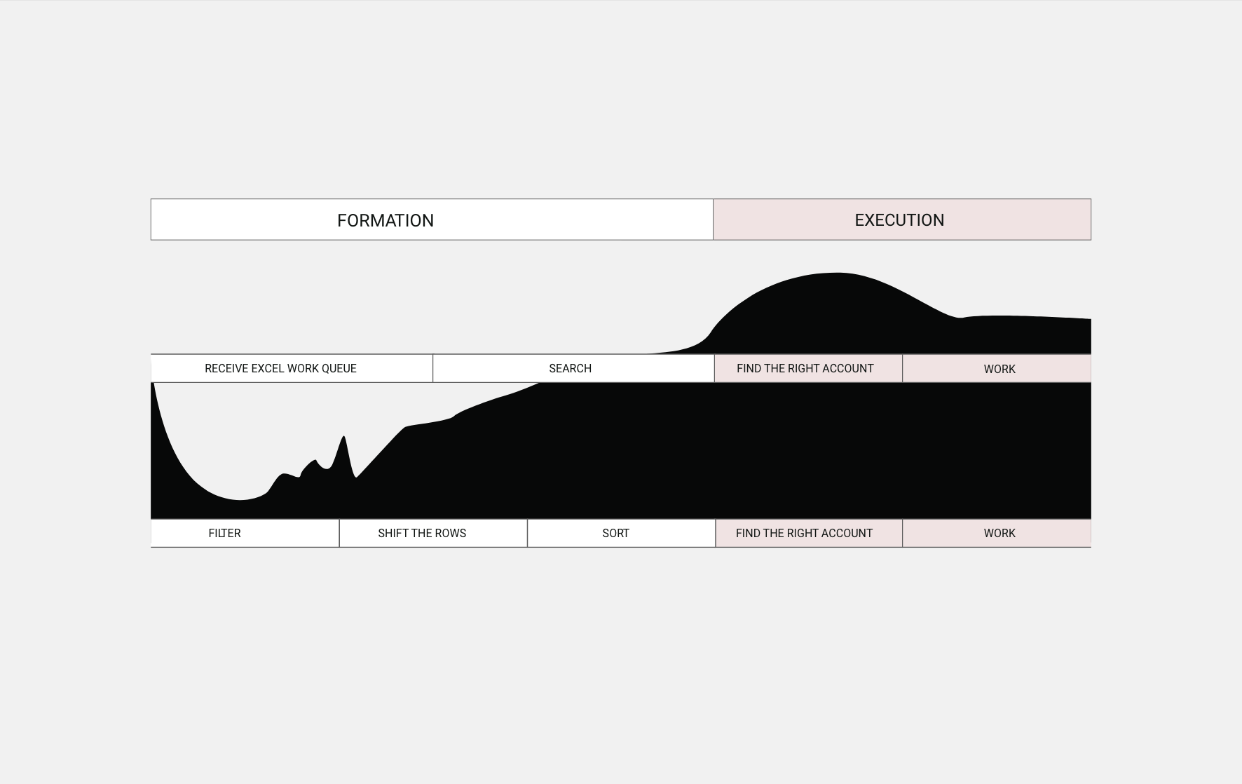
Managing and prioritizing accounts was complex and time consuming, even for experienced users. This revealed the need for better workflow organization and clear success metrics. We created a framework focused on time, ease, and accuracy.
Goal
Analysts continuously working in Compass
Increased worked accounts per day
Analyst performance satisfaction
Time from login to starting work on accounts
Alert
Uninterrupted time
Number of accounts
Stress and satisfaction
Time frame
Metric
Estimated time
Accounts per day
Analyst satisfaction
Estimated time from login to account open
The Problem
In Compass, analysts struggle to identify priority accounts due to a cluttered grid and unreliable filters, often relying on managers for support.
Goal: streamline account management so analysts and managers spend less time organizing and more time working accounts.
We aim to help analysts and managers save time on organizing and prioritizing accounts, so they can focus more on working them.
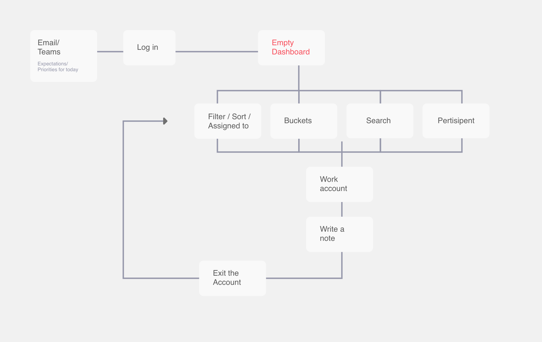
The Redesign
The home page
We introduced a new home page dashboard in Compass, giving users a clear starting point to access their work. Instead of an empty screen, analysts now see personalized queues created by themselves, shared by managers, or assigned by service line, making it faster and easier to find and manage their accounts.
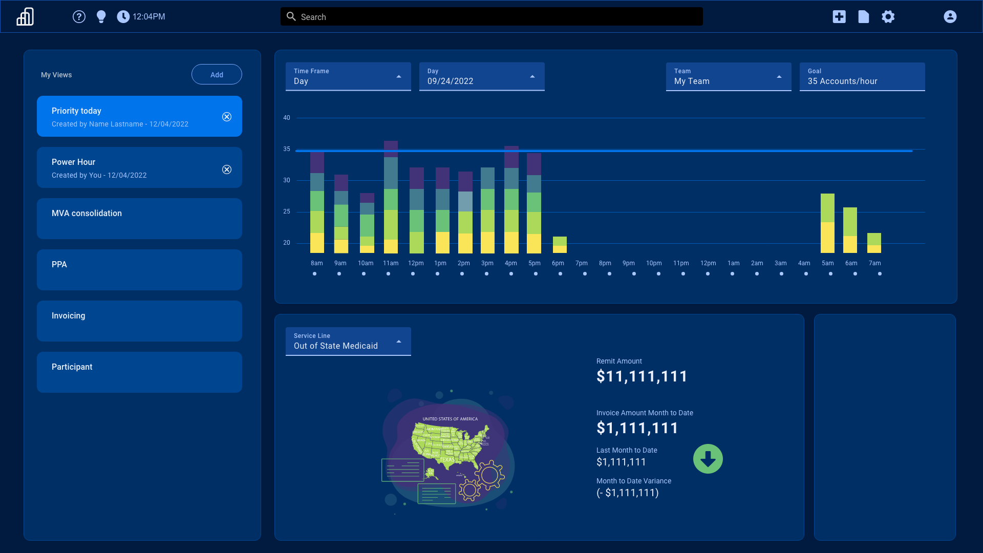
- Work queues — categorized queues on the homepage created by analysts, shared by managers, or assigned by service line.
- Work progress — graphs show daily progress and revenue impact, with a team view for managers.
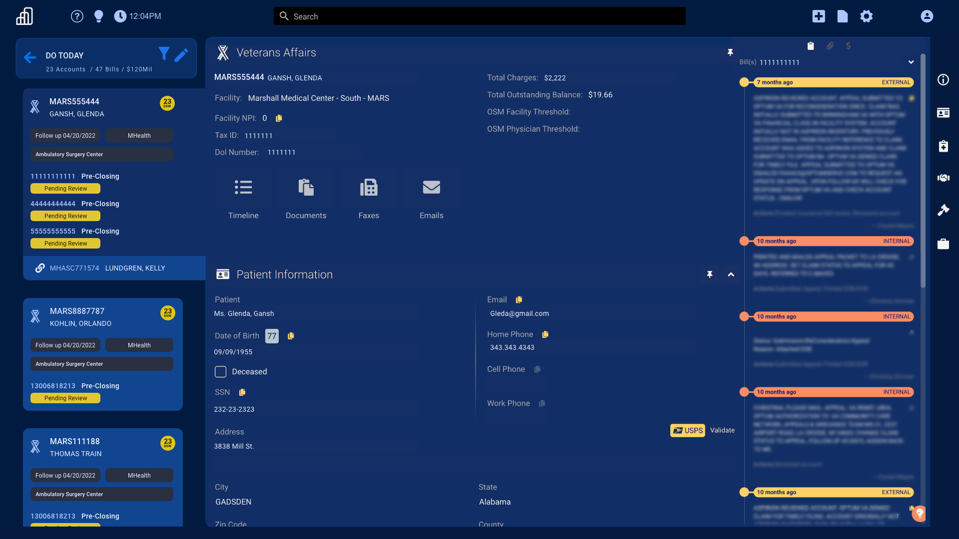
- From grid to cards — the old scrolling grid is now clean, informative cards for easier review.
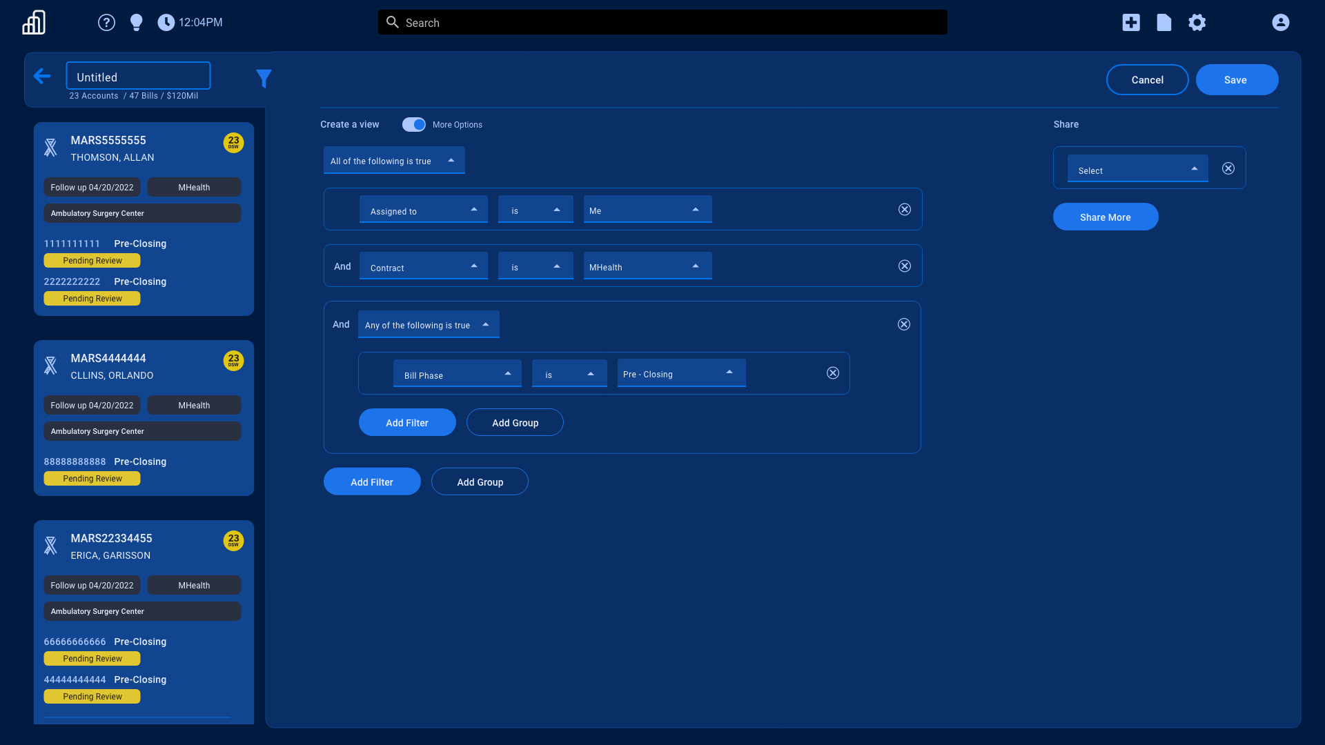
- Query builder — a simple tool to create and filter custom queues quickly.
- Collaboration — share queues; records lock when opened to prevent overlap.
- Focused workflow — all accounts in a clear card layout with priority accounts prominent.
How we got here
Design with an idea in mind
Three primary questions informed the strategy:
- Who is everyone, and how do we design for them?
- What scenarios and cases need to be considered?
- What is the optimal workflow?
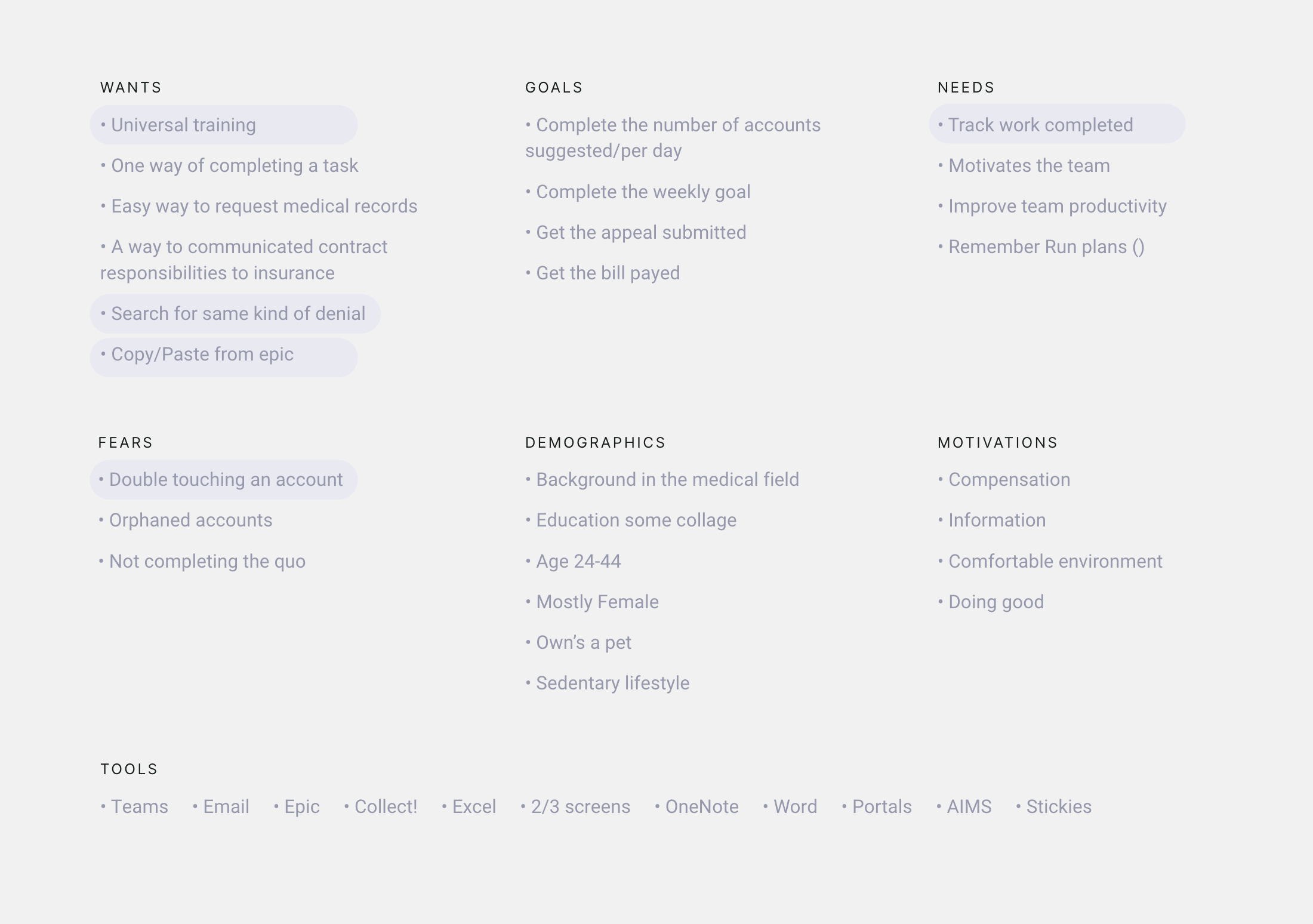
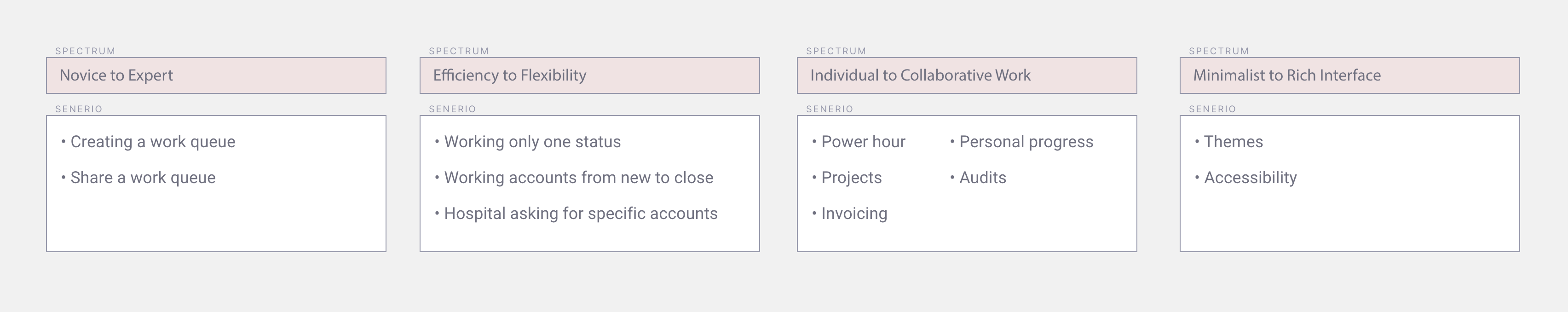
I conducted in depth user research and created a framework of spectrums and situations, supported by a user persona, to guide design decisions. This shared framework helped the team align on user needs and deliver a more inclusive, user centered experience.
After mapping the ideal process, we reverse engineered it to uncover four key design challenges:
- Streamline workflows to help users complete accounts faster.
- Simplify the work queue process to reduce effort and save time.
- Replace the grid dashboard with a more intuitive format.
- Adapt the system to handle changing workload demands from facilities.
Testing
Prototypes were validated live with users. Feedback led to improved terminology and clearer interface elements. Rollout adoption exceeded expectations.