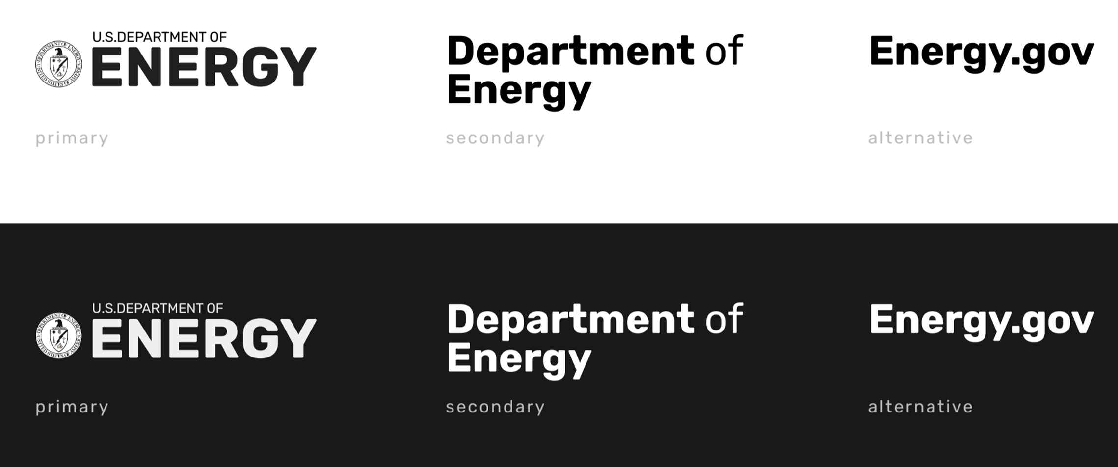
Energy.gov
While attending the UX/UI Bootcamp at Georgia Institute of technology, our team was tasked with redesigning a government website - Energy.gov. During research and discovery, our team realized that the majority of users over 85% were coming to the site looking for specific information. With participants tests and navigation tests, we learned that the site had contrast issues that made titles challenging to read, often frustrating users. Our team organize the content, gave Energy.com a modern look, and highlighted the search bar making it easy to read and navigate.
Users were overwhelmed by the vast amount of disorganized information on the site. How might we redesign Energy.gov to be a go-to hub for information about green living and alternative energy sources?
Prioritize search feature, introduce a new navigation system, and redesign energy.gov with a modern twist.
Research & Discovery My team performed user interviews and tests, established personas, designed flows, annotations, and color testing.
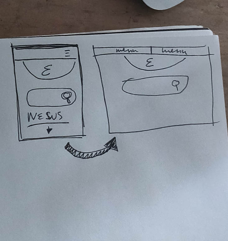
Intuitive Navigation Through testing and card sorting, we were able to fully grasp the size of this site and give it a more logical organization and eliminate repetitions.
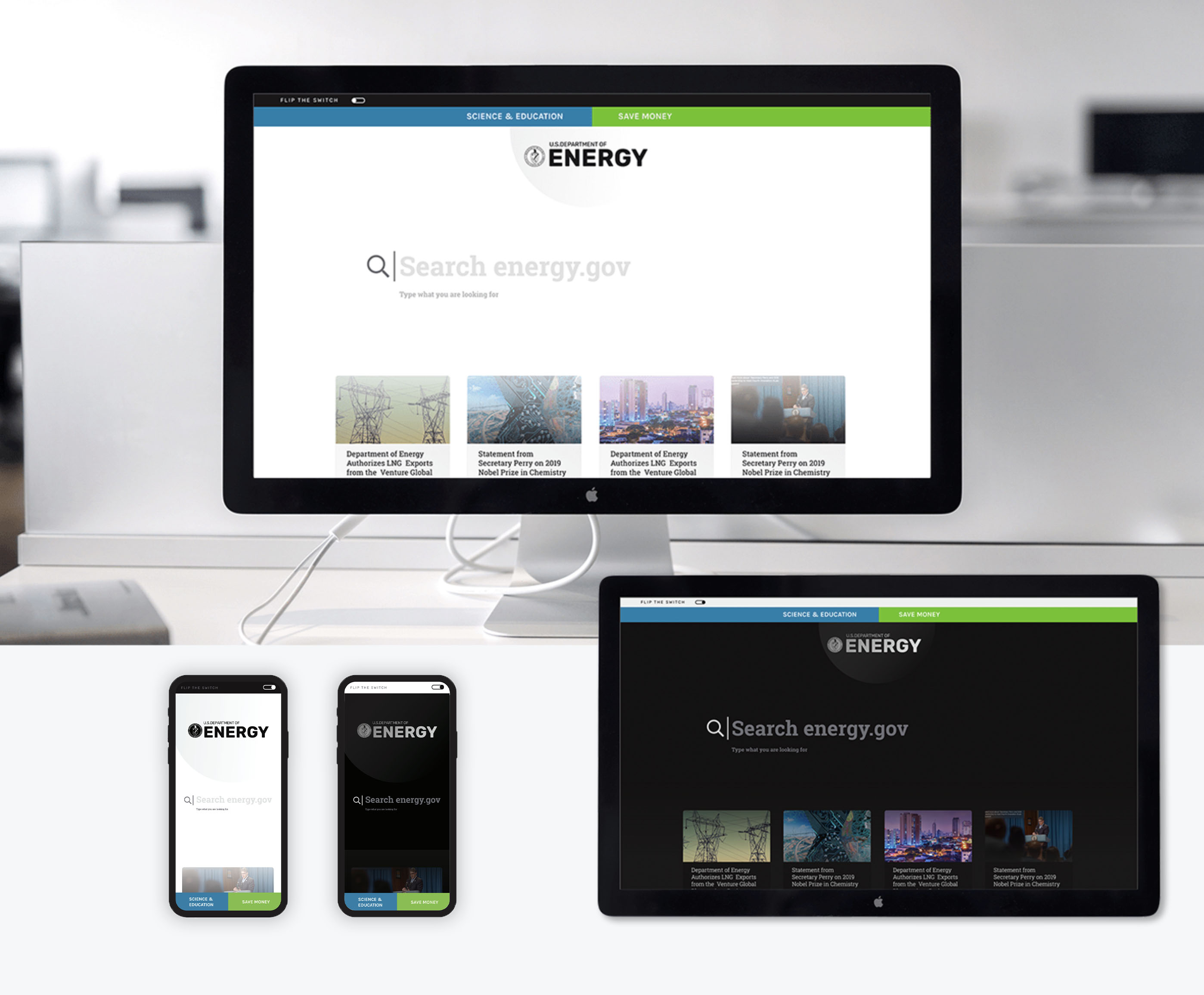
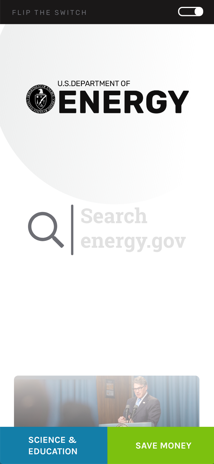
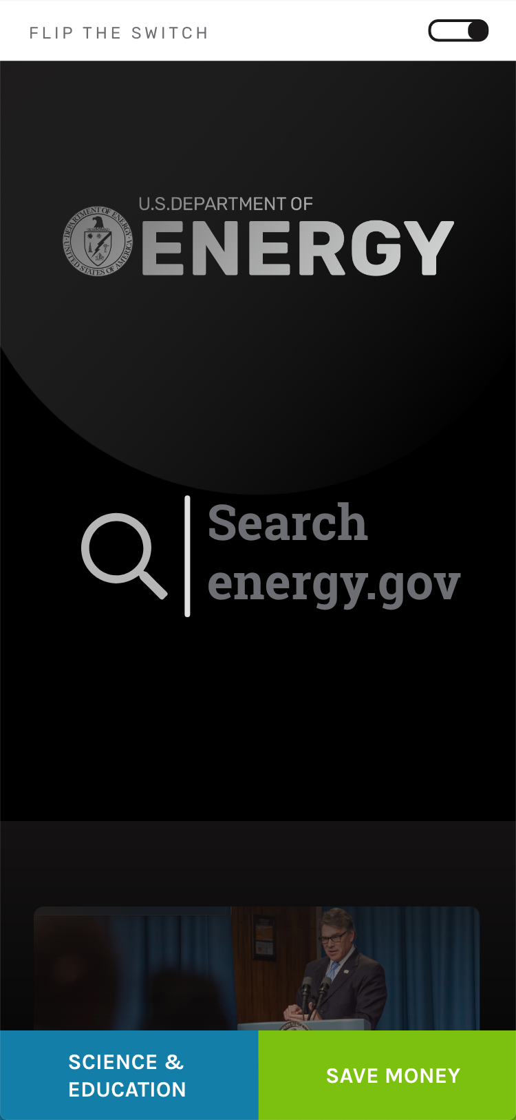
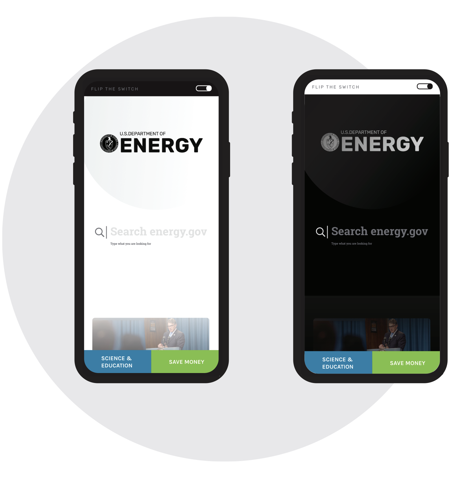
Redesign Inspiration I was inspired by a user quote - when asked what energy means to them. They replied, "energy is the difference between light and dark." Also, our approach was to focus on mobile-first. We made sure the content flowed on mobile devices as well as it did on full-sized browsers.
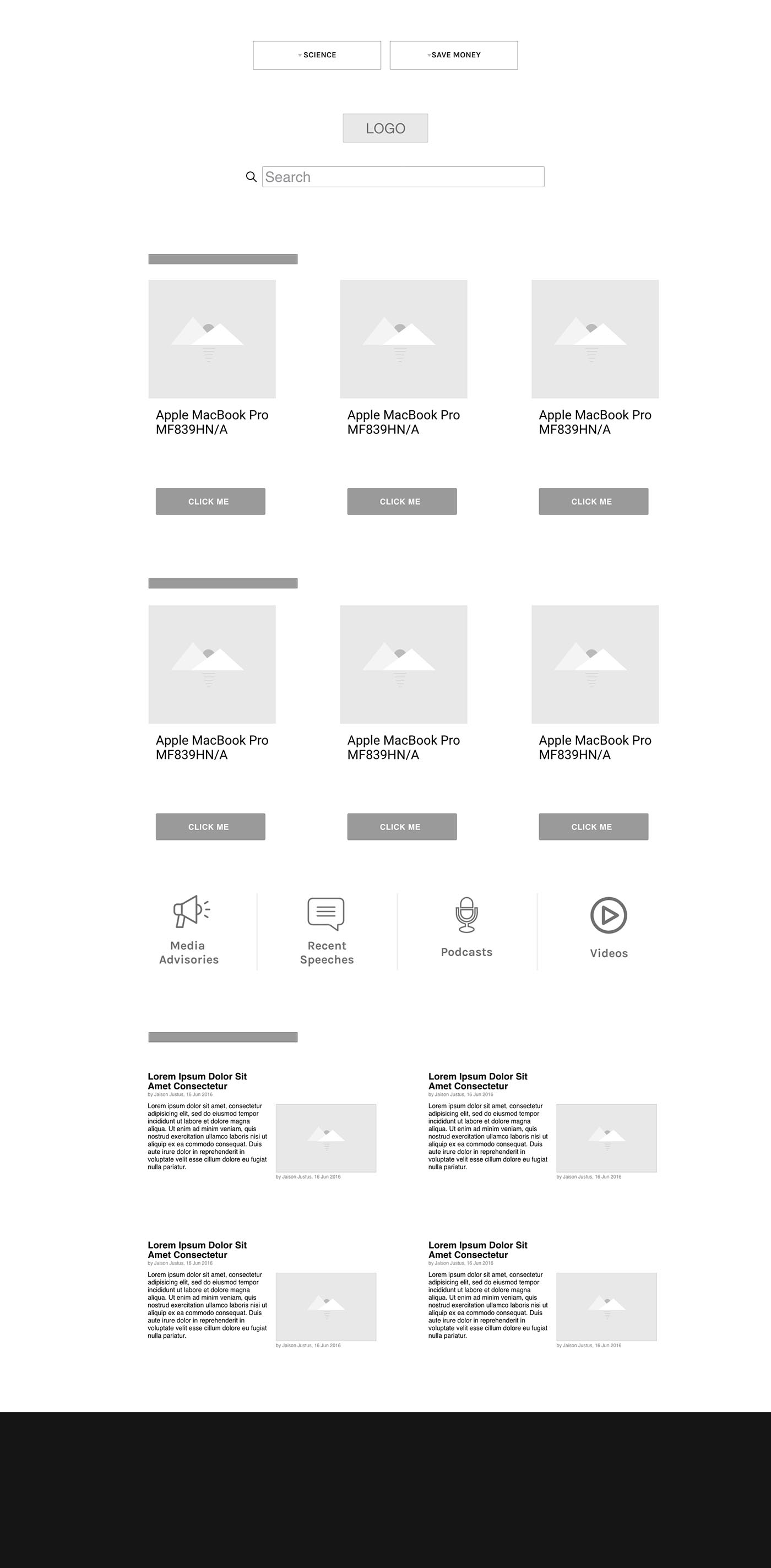
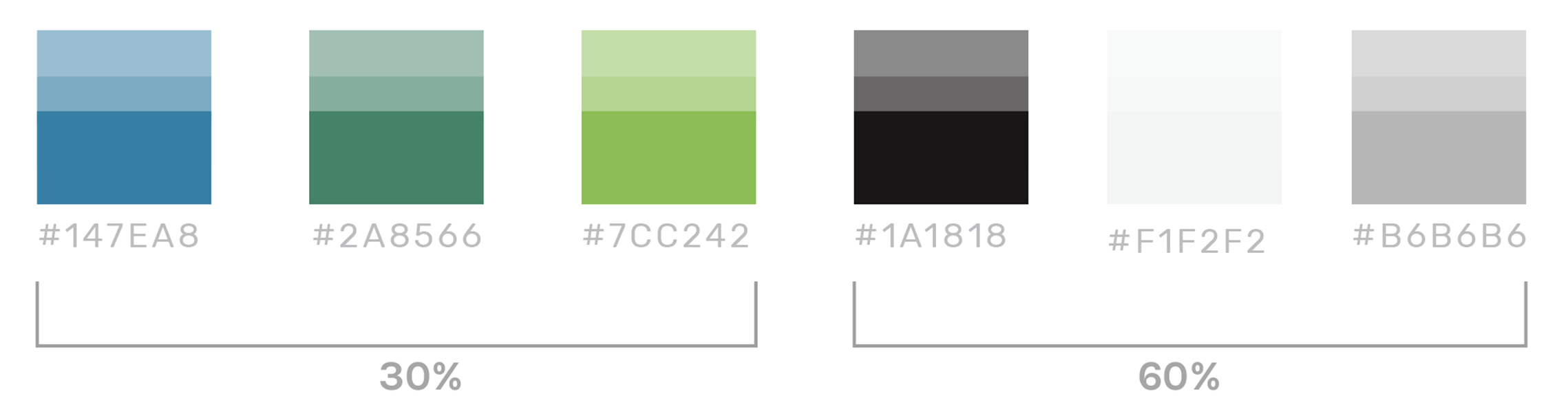
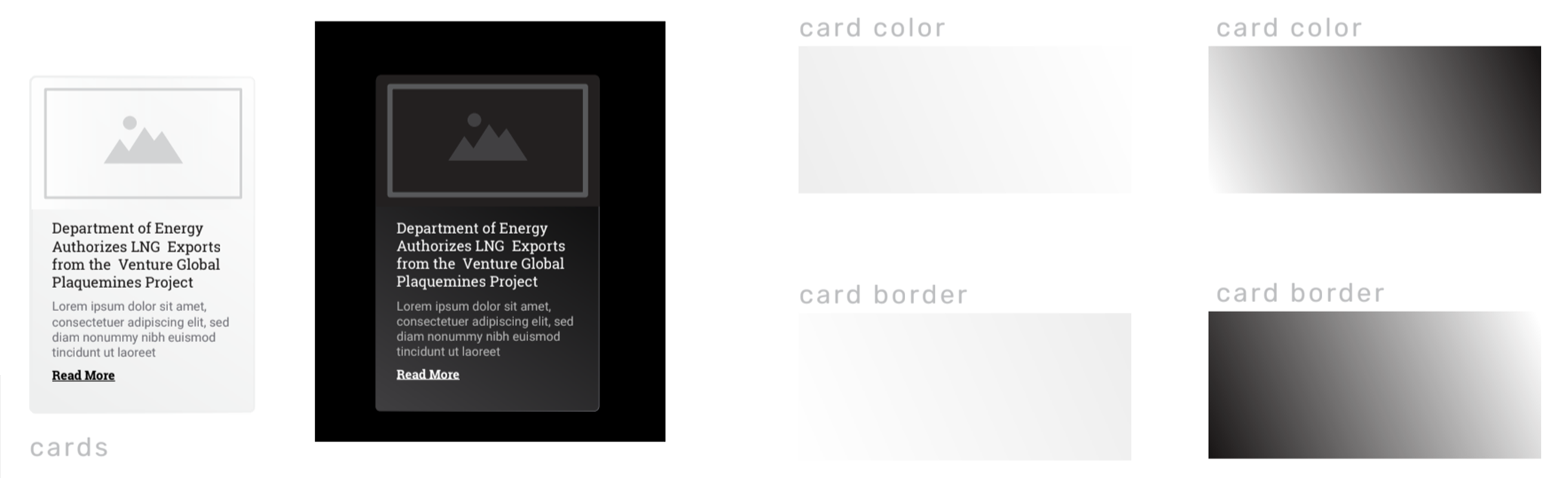
Design System I chose an immaculate and minimal design inspired by users.
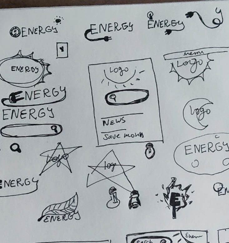
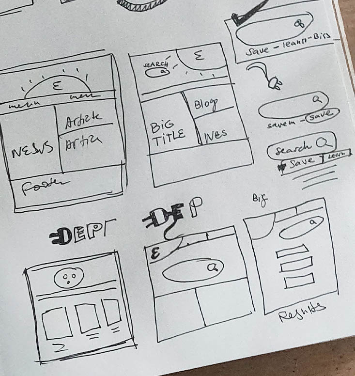
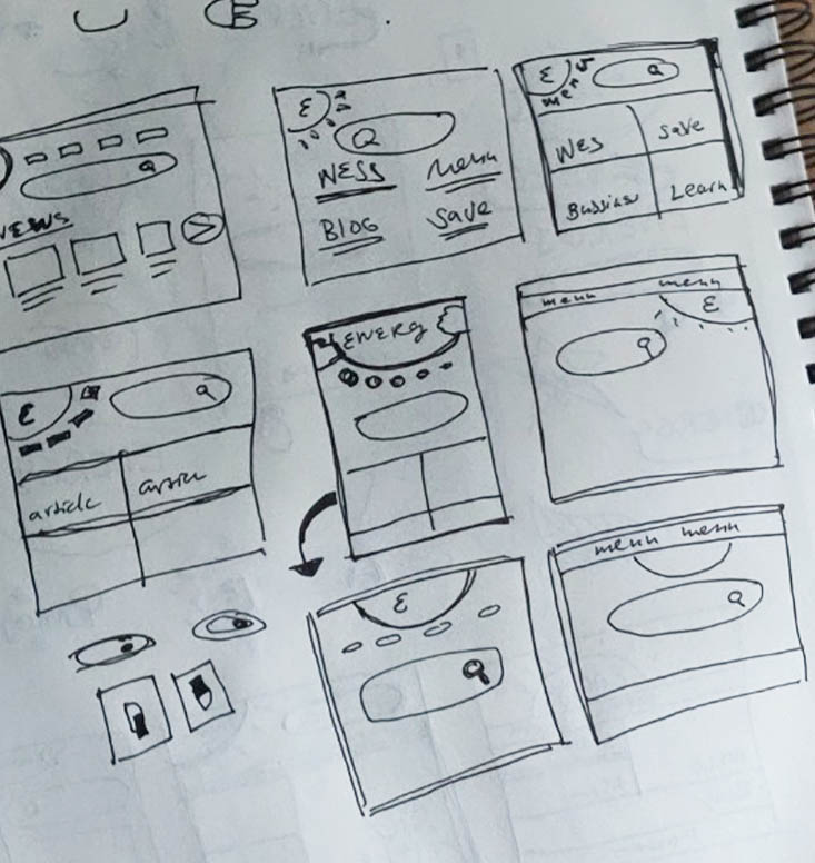
Sketches, Wireframes and Prototypes Sketched out flows, used Adobe XD to build wireframes and prototypes implementing the minimal design system.
Our team of four completed interviews collected survey data and performed usability tests. We analyzed the research data together. I ideated, sketched, and prototyped the solution, and develop the design system.
Timeline: 4 Weeks
Research & Discovery
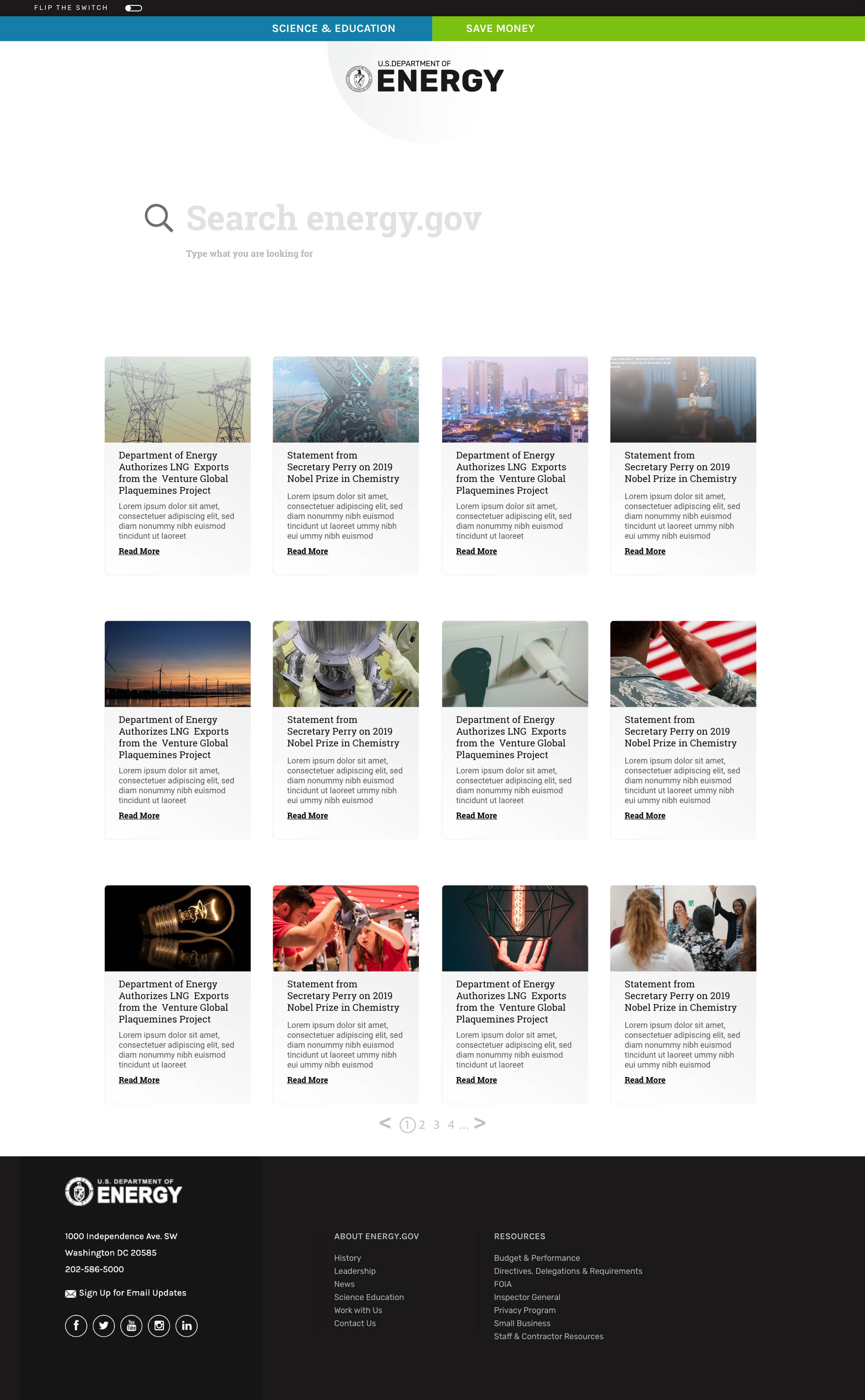
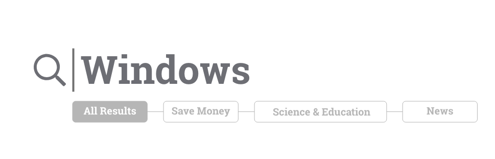
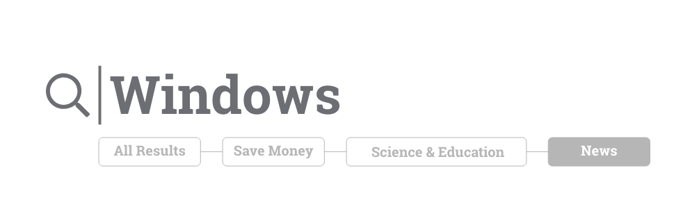
Conducting interviews with users and watching them navigate the site led us to conclude the DoE's primary users go to the website for a specific reason, and their main frustration is finding the information they set out to get. Due to the immensity of the site, they often rely entirely on the search function to find the information they need. This finding led us to redesign the home page with the search bar featured in a primary and central location.
Here is what some interviewers had to say:
"This is confusing. I would not think this is a drop-down menu. I mean, there is no indication." Drew Conners
"Is this it? No right? I don't think this is it" (When an article loaded improperly for the second time)
Beckah Beckmen
"That is too many clicks. I would not know to click that"
Courtney Dobec
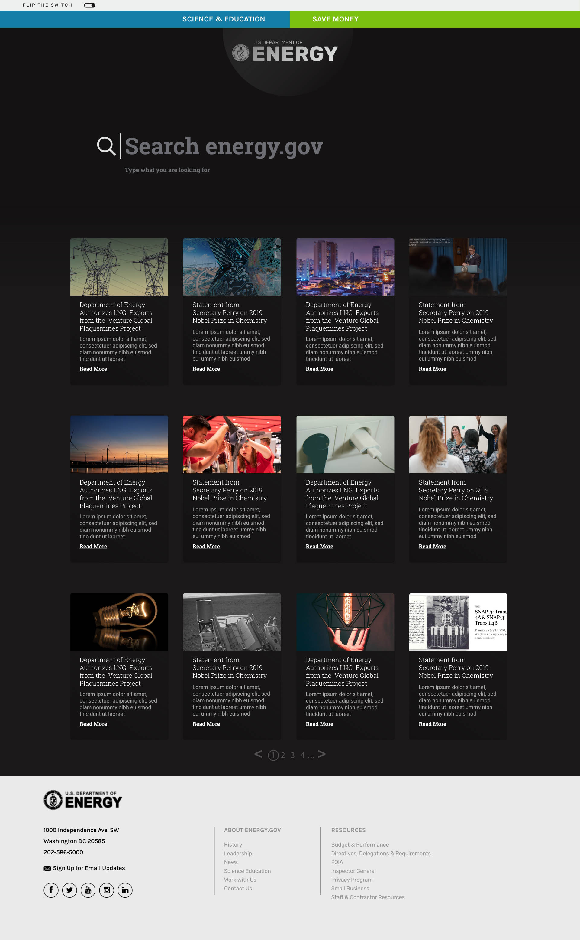
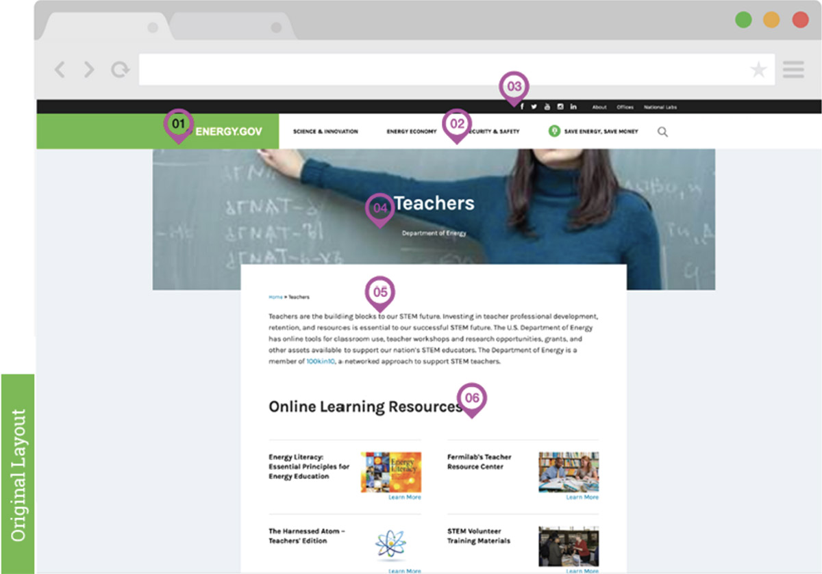
Our test subjects also found it difficutl to read, especialy the homepage highlighted articles. The titles are displayed over busy images making them hard to read.
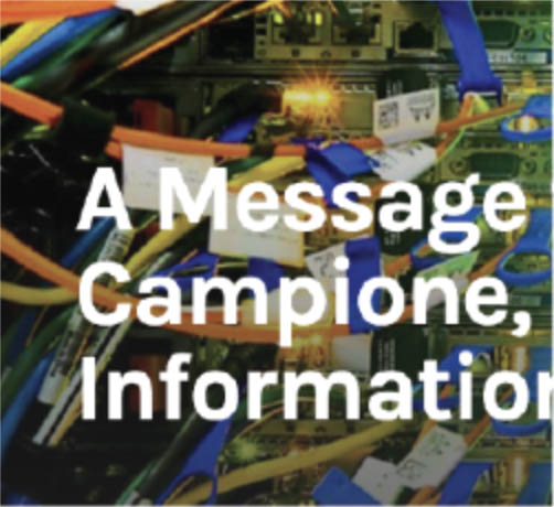
On highlighted articles, the titles are displayed over busy images making them hard to read.
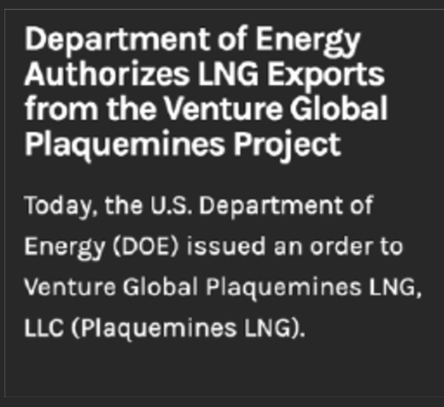
Primary articles are apparent, with a nice contrast between text and background.
User Persona & Flows
Although a user persona is considered a bit outdated, it is a tool, and it can prove useful in inspiration and steering design decisions, even more so when complemented with a scenario to shows tangibility and realism. From testing, after completing the test subjects ware asked if they saw an article they wanted to click on the site, almost all wanted to explore the save money category of the website.
Samantha Kurz | 42years
Middle School Physics Teacher
STEM Club leader
Scenerio
Sam starts her school day by reading Energy.gov to seek inspiration and to find engaging information to intrigue her pupils. Also, she recently bought a home and is determined to make it energy-efficient and to save money on utilities.
Legend:

Research findings,
which test subjects repeated.
- Goals
Make complex information fun and engaging.
- To leave greener pastures to future generations.
- Impact the world with her teachings.
- Inspire students to care about the environment.
- Needs
- Inspired students.
- Eliminat her carbon foot print.
- Flexible teaching plan.
- Pain Points
- Implementing clean energy techniques in her busy life.
- Her teacher's salary is not competitive.
- Class control, managing 8th graders.
- Visits Dayly
- Class Dojo
- Gmail
- Real Simple Magazine
- Rides the train
Flows
I compile the flows around everyone's ultimate use of the search bar.
User Goal Find specific information/article.
Task Flow
User lands on the home page.
Users types in the search filed.
User perfects the search by clicking a category if they can't see immediately what they are looking for.
User finds the information needed.
Wire Flow
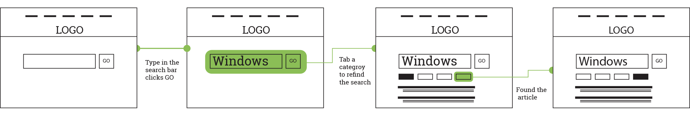
User Flow


Annotations, Heuristic Analisys
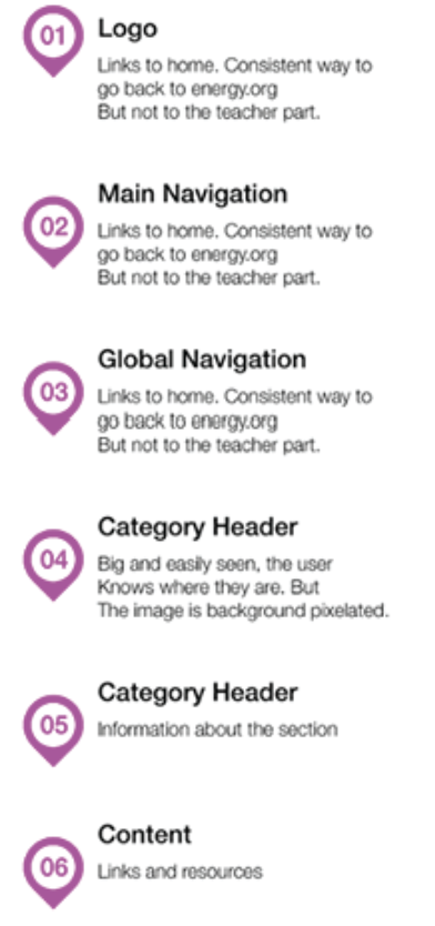
To better understand the frustration of the users. My team did a heuristic analisys and discovered layout inconsistency throughout different sections of the site. There are four different menu systems with no clear indication on how to go to the starting point. The site is massive in content with multiple micro sites catering to a wide variety of users. But yet the search option is almost hidden.
Link to the full Heuristic Evaluation